openBuild
  • Introduction
    • Introduction
    • The Framework
    • The Library
    • Release Notes
  • Core Concepts
    • Bubble vs openBuild
    • Responsive Design
      • Repeating groups
      • Advanced Responsiveness
    • Styles
      • Typography
      • Colors
      • Groups & Box Shadow
      • Inputs
      • Buttons
      • Style Variations
      • Changing styles
      • Custom CSS
    • Pages
      • index
      • base-menu
      • base-top
      • base-ribbon
      • base-mobile
      • admin
      • verify
      • styleguide
      • terms
      • login
      • reset_pw
      • privacy
      • 404
      • Menu
      • Base Layouts
  • WORKING WITH the framework
    • Getting Started
    • Navigation
      • Go to page
      • Navigation through custom states
      • Navigation through URL parameters
      • Navigation through URL parameters with Option sets
    • Data & Workflows
      • Custom States
      • Custom Events
      • Working with Reusables
      • CRUD
      • Source Popup
      • Backend Workflows
    • Users and Roles
    • Signup, Login, Password reset
    • Security & Privacy
      • Authenticating endpoints
    • Transactional Email
      • Setup Sendgrid
      • Setup Postmark
    • Alerts and Confirmations
    • Customization
    • Best Practices
      • Syntax
      • Color Coding
  • openBuild Library
    • Chrome Extension
  • Framework Elements
    • Menus
    • Option sets
    • Plugins
    • API Connector
    • User Access Management
    • CRUD Floating Group
    • CRUD Popup
    • Data Table
    • Security Redirect
    • Mail management
    • User Settings
    • Header & Footer
Powered by GitBook
On this page
  • Communicating with reusable elements
  • How to add a new group in the reusable element
  1. WORKING WITH the framework
  2. Data & Workflows

Working with Reusables

PreviousCustom EventsNextCRUD

Last updated 2 years ago

Communicating with reusable elements

This explanation is based on pre-built workflows in the openBuild template.

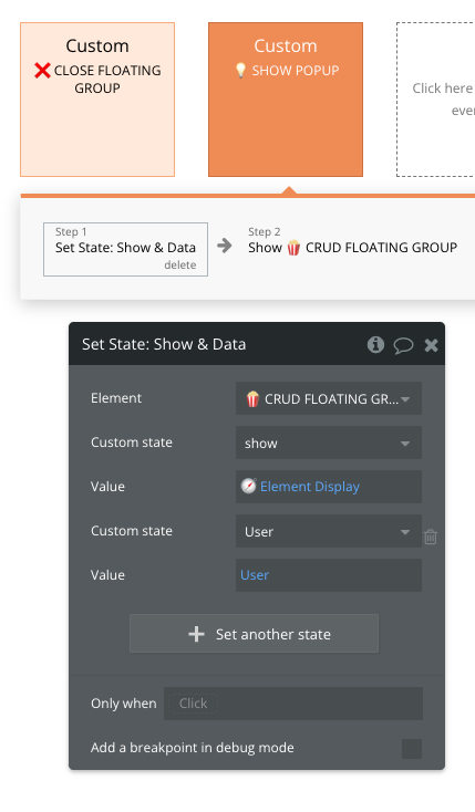
In 🍿CRUD FLOATING GROUP and 🍿CRUD POPUP reusable elements you will find a pre-built 💡SHOW POPUP workflow.

The workflow consists of 2 actions:

  1. setting states on the reusable itself and

  2. showing the reusable. When triggering this Custom event we are required to always pass the 🧭 Element Display parameter (which is based on the option set) and User datatype.

The second parameter is optional since we don't always need to manipulate the User object. When you will add additional parameters to this Custom Event, most of the time all of them (except the Nav Reusables) should be marked optional.

The passed parameters are set as a state on the reusable so we can act based on the information provided.

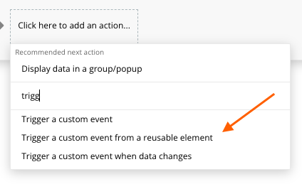
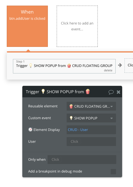
When we place a reusable element on the page or inside another reusable element we do get access to an action called Trigger a custom event from a reusable element.

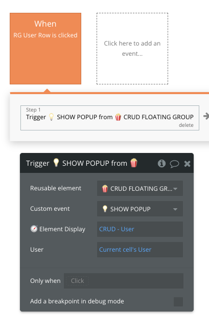
In our case, we are clicking RG User Row which contains information about the User datatype. When clicked we want to trigger the 💡SHOW POPUP workflow from the reusable and the information we need to manipulate the object.

When triggering 💡SHOW POPUP we are required to pass the right 🧭 Element Display option set to display the right section. Since we want to display the user details section we are passing the 'CRUD - User' parameter.

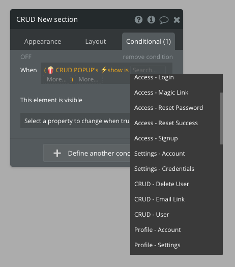
The visibility of the CRUD - User section in 🍿CRUD Floating is based on conditional logic.

The elements inside the CRUD - User section are referring to the main datapoint which in this case is 🍿CRUD FLOATING GROUP User - the top-level datapoint in the Reusable which values we set with '💡SHOW POPUP' custom event.

How to add a new group in the reusable element

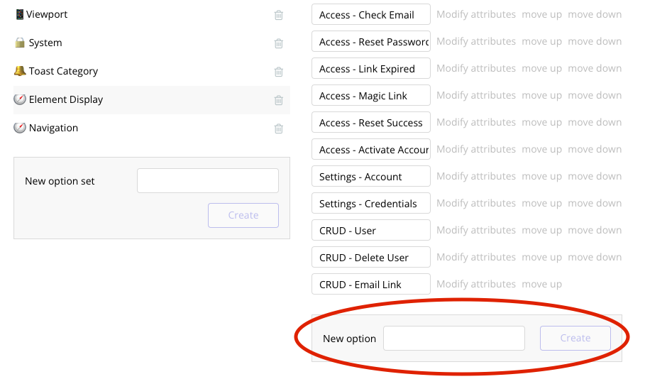
1. Add a new option to 🧭 Element Display option set

2. Copy or add a new group section

In the template, you will find 3 template sections inside the 🍿 CRUD Popup and 🍿CRUD FLOATING GROUP. These are:

a) CRUD Template

b) MSG Template

c) MSG Template Icon

You can duplicate those or you different section with workflows already connected (e.g. CRUD User).

3. Set or update conditional on the newly created section

Remember that all sections inside the reusable should not be visible by default!

4. Make sure to use the new option when triggering 💡SHOW POPUP custom event

Notice that only 🧭Nav Reusable parameter is required
We want to show CRUD User section so we pass 'CRUD - User' from Nav reusables Option Set
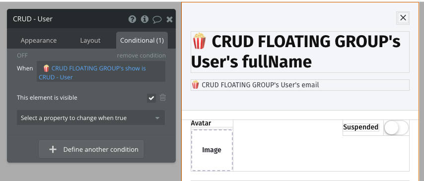
When conditional is true, the CRUD - User section will be visible
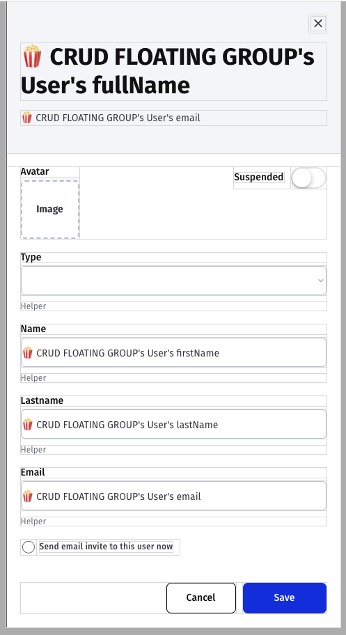
User details section inside the 🍿CRUD Floating
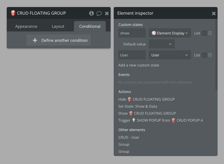
The state 'show' on the 🍿 CRUD Floating Group is an option set type '🧭 Nav Reusables'
Trigger a custom event from reusable and pick your newly created option